Last updated: February 12, 2024
When blended together, red and blue make purple. It’s a simple process, that can be a lot of fun when applied to your arts and crafts. The more you understand color mixing, the more variations of purple you can create. Some bright purples are vibrant and exciting, other lighter purples can be mellow and relaxing, and deep purples offer an air of mystery.
Color mixing is among the most rewarding elements of the visual arts. It influences the entire mood and sensory experience of your arts and crafts. Though it can seem mystical at times—particularly when you produce a color or shade that’s just right—all color theory can be explained with science. However, the way that a particular shade of purple can make you feel? That’s another matter entirely.
Once you understand the basics of the color wheel, you’ll know exactly how to mix the right purple for the job. Whether you want to combine colors in your arts and crafts projects, experiment with shades while coloring our unique pages, or explore vibrant options for home decor, this page is here to inspire and guide you. But remember, the best way to see how red and blue interact is to experiment and see for yourself!
Blending Colors |
How to Mix Purple |
Purple Variations |
Troubleshooting |
Purple Aesthetics and Inspiration
Red and Blue Make What Color?
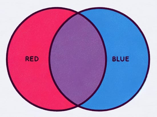
Red and blue are considered primary colors. Any time you mix two primary colors, you create a secondary color. In this case, when you mix the primary color red with the primary color blue, you make the secondary color purple.
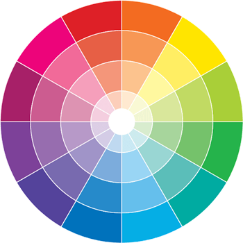
This is called red, yellow, and blue mixing, otherwise known as RYB mixing. It works best when you’re getting creative with markers, colored pencils, paint, pigments, and other physical coloring media. You can track the interactions of RYB mixing on a color wheel, which depicts how primary colors blend to make secondary colors, including purple, orange, and green.
The appearance of the purple that you blend depends on a few aspects of the red and blue media that you’re using, such as the pigmentation, lighting, ratio of blue to red, and the warm and cool undertones in each color.
For example, red and pink colors are considered warm, and they can easily be blended into more vibrant colors of purple or violet. On the other hand, blues are considered cool-toned colors that are used to create softer or greyed tones of purple or violet.
How to Mix Blue and Red to Make Purple
Mixing colors is all about the joy of experimentation. Sometimes, giving yourself the space to play around is the best way to find the shade of purple that you want to use. Blending paint can be one of the easiest ways to learn color blending. Here’s how:
- Make a palette with blue and red on it. Give yourself a good amount of these primary colors. Make sure there is plenty of space between them. This way you won’t be shy about making a lot of different blends.
- Using a brush, add equal parts of red and blue together. While they will be distinct colors at first, the more you blend them, the more they will become a new third color: purple.
- You can then adjust the tone of the purple you’re making based on the mood that you’re trying to create. If the color feels too red, then add more blue. If, however, it appears too blue, then add more red.
- You can also add black and white to your palette to mix tints and shades. Just remember, you might need a lot of white to lighten a deeper shade. At the same time, a small amount of black can go a long way.
Where do the colors red, blue, and purple come from?
Many less expensive paints that you will use for practicing are made from synthetic pigments.
However, natural reds and historical red pigments were most often derived from iron-oxides and cadmium. These metals are still the basis of many red paints. (Note that cadmium is a toxic, naturally occurring metal that should not be consumed.)
Originally, blue pigments would come from precious stones and minerals, such as azurites or lapis lazuli. Now blue pigments are mostly synthetic.
The word purple comes from the ancient world and refers to a color created from the shell of a sea snail. This created a reddish magenta-purple and is the reason for our association of purple with royalty and riches.
Mixing Different Tints, Shades, and Tones from Red and Blue
In many cases, you won’t be able to mix the pure primary versions of red and blue. In order to blend your ideal purple palette for your arts and crafts projects, it’s very helpful to be aware of the other colors present in the reds and blues.
Most artworks use more than one version of a color. Many using many different tints, shades, and tones allows for shading. Shading mimics the effects of light on a scene, where lighter tints indicate something that a light source is shining upon. Darker shares, on the other hand, indicate those parts of a picture that are in shadow. Adding shadows and highlights to your work is crucial for creating three-dimensional realism.
In order to do this, it’s useful to know how tints, shades, tones, and color temperatures work.
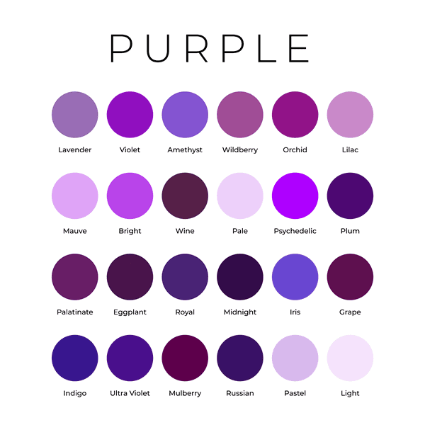
Purple Tints (by Adding White)
When you use white to lighten your purple blend, you are creating a tint. You can use tints to add highlights to your artwork.
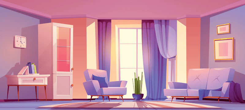
Purple tints can also soften the color. Lavender is a common purple tint. Light purples are often used in spaces focused on relaxation, such as meditation and living spaces.
Purple Shades (by Adding Black)
When you use black to darken your purple blend, you are creating a shade. You can use shades to add shadows to your artwork. Keep in mind, however, that not all blacks are pure. Many blacks will have blue or brown undertones, which will alter the appearance of the purple you make.
Shades deepen the purple you create. For example, eggplant is a common shade of purple. Dark purples and violets create mystery and drama, and they can be used as an accent to add depth and intensity to your designs.
Purple Tones (with Gray and Brown)
The purest way to create a tone is to add gray (a mixture of white and black) to your purple color. Toning down a color dulls the color and decreases its intensity.
However, if you want to give your color a muted appearance without dulling it, you can try mixing in a complementary color.
You can remember this by thinking about the color wheel. Since yellow is opposite to purple on the color wheel, they are complementary colors. This means that these colors pop when they’re used in the same composition. When blended, though, they become brown. This is why when mixing two colors with complementary undertones, your blend can take on a brown tinge.
To make an earthy purple, try adding a little bit of yellow to your mix. Do this gradually, however, to avoid making everything brown.
Indigo, Violet, and other Cooler Purples
Blue is the coolest-toned color on the color wheel. This means when you mix more blue than red, you are creating a cool-toned purple, such as a violet or indigo.
Violet generally refers to a purple that has more blue in it than red. Similarly, indigo refers to a deep purple that has a lot of blue mixed into it, creating cool undertones. In fact, it can sometimes be difficult to tell the difference between indigo and navy blue.
Magenta and Warmer Purples
Red is a definitively warm color. Mixing more red than blue creates a warm-toned purple. This color is sometimes called magenta, which is a rich purple with pink undertones.
What Affects the Purple that You Mix?
Having trouble blending just the right shade of purple? The below considerations can help to set you on the right path.
Purple Aesthetics
Purple is a beautifully versatile color. It can move easily from vibrant and almost electric, to a kind of introspective moodiness. It’s warmer than blues and softer than reds. This allows it to be associated with deep emotions, reflecting all their material and aesthetic richness. Purple-toned paintings often give off a sentimental and internal beauty, without the mournful connotations of cool-toned and blue art.
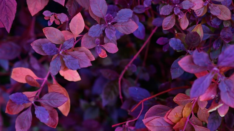
There are also many forms of purple easily found in nature, from plants and flowers, to amphibious animals and birds. Many shades of purple that we commonly use are named for the plants or fruits associated with them.
Ultimately, this is the color of mystery. Colors of violet, purple, and magenta historically evoke power, royalty, riches, luxury, creativity, beauty, and even magic.
Start Using Purple with Our Favorite Coloring Pages
Check out some of our favorite coloring pages to get started with mixing your favorite purple and magenta tones.


