The start of a new year is usually a time when we start looking for ways to make something a little better. That something could be our life, work, or what we produce. Web designers, for example, might look for ways to make their designs more interesting or effective.
In this post we will focus on 5 web design trends that are designed to help users get the most from the websites they visit and we will use 10 pre-built websites from BeTheme to demonstrate how best to implement those trends .
BeTheme is one of the world’s most popular and highly-rated WordPress Themes with 268,000+ sales and a 4.83/5 star-rating.
5 new web design trends for 2023
To improve anything, you have to know what it does or how it functions and what can have an impact on its performance, whether that impact is positive or negative.
In our case, we want to have a impact on web design that will lead to improvements, which is what web design trends are expected to do. What follows is a discussion on how 5 trends designed to act in the best interests of web users can be implemented.
1. The benefits of hoverable iconography
One effective way of avoiding clutter is to keep the amount of text on a page to a minimum. A strategic use of icons can admirably serve that purpose – assuming users understand what the icons represent!
When a situation is encountered where an icon would serve a purpose but it is not a familiar one, it would appear to be a no-win situation. You could of course add text, but that would contribute to clutter – or would it?
Let us first start with an example of familiar icons. On the BeBiker 4 website there are three icons on the left for:
- Shopping bag/cart
- Search
- Account
When these icons are used over and over again, on one website or many, users immediately understand what they represent.
How then, do you address icons that are less familiar or don’t give a user an obvious clue as to what they represent?
You could give each one a brief description, but that would require adding text – which, as you will see in the BeJeweler 2 site, is not a bad idea, but a very good one:
Hover-triggered helper text is the answer in this case, and it can have other uses as well since it can provide useful information without adding clutter. Hover-trigger helpers can increase user confidence and give those same users the impression that the website owner has their interests in mind.
2. Use social proof to build trust
Trust is an important part of relationship building, whether that relationship is personal or one a brand has with its customers. In the latter case, websites often serve as the initial touchpoints between brands and consumers and is where trust building needs to be initiated.
Using social proof to build trust is a trend many web designers will add to their skillsets in 2023.
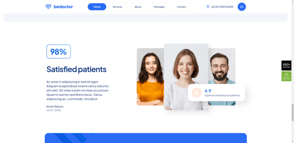
One effective trust building approach used in website design entails a page dedicated to genuine testimonials and reviews along with a home page section that does the same, as demonstrated in the following BeDoctor site example:
BeDoctor uses three distinctive trust-building types:
- A customer satisfaction rate
- A customer testimonial
- An average customer rating
- of which the latter could be linked to a ratings platform such as Google or Yelp.
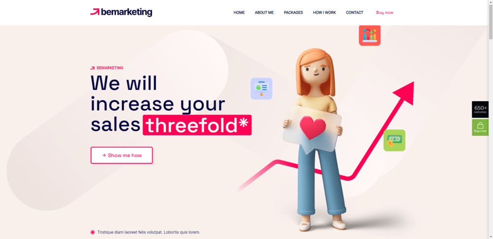
Newer businesses that lack social proof to use for trust-building may need to rely on using trust marks instead. Placing an icon next to a “Checkout” button that signifies the transaction will be secure would be one example. Another example, shown in the approach taken by BeMarketing 2, is to add context to its website claims:
In this example, the “threefold” asterisk is repeated to include a brief textual statement linking to a page where proof to the claim is documented.
3. New mobile-specific trends
Given rules and straightforward procedures to follow, web designers have become quite proficient at addressing mobile design needs in recent years. So much so in fact that, in those instances where designers have found a comfort zone, stagnation has set in.
Nevertheless, there remains room for improvement. In 2023 we will see greater attention paid to mobile-specific features that focus on overcoming specific frictions and obstacles.
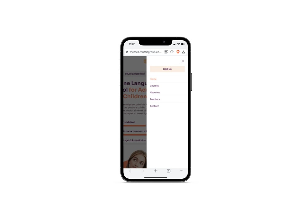
The BeLanguage 4 pre-built website addresses one of these in its navigation design:
Note how the “Call Us” button is located at the top of the list of links, rather than at the end where it would normally appear on a desktop display. A slight change perhaps, but a helpful one for a mobile user.
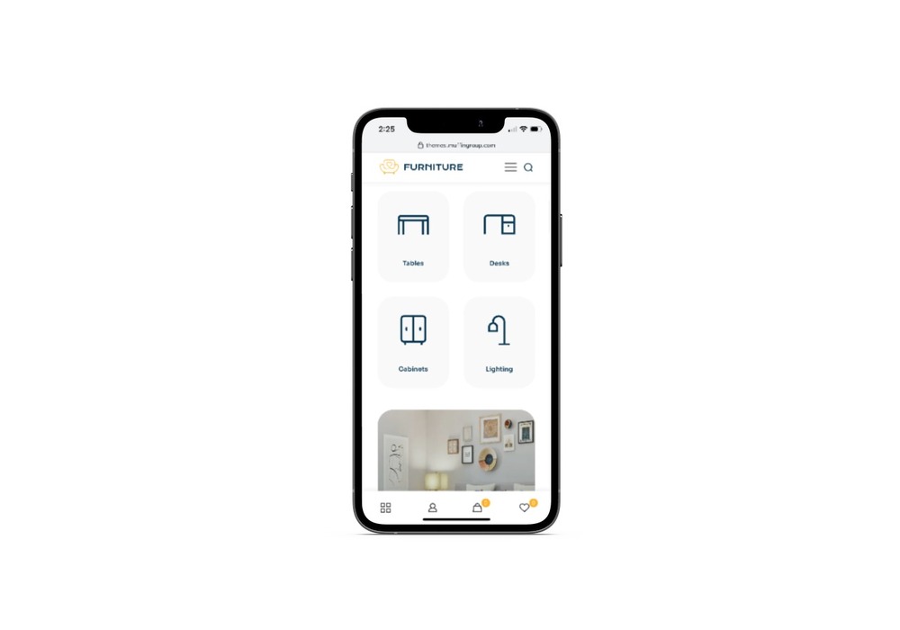
The BeFurnitureStore approach takes the account, cart, and favorites icons that are normally situated at the top on a desktop display and places them on a sticky bottom banner.
The use of sticky banners is also advantageous to mobile users. As long as web designers work to continuously improve the mobile web experience, it doesn’t matter how small some of their changes might appear to be. Mobile users will gain from them.
4. Shape texturization
Skeuomorphism was once the rage and played a dominant role in the web design world. This was at a time when web users were still getting used to the technology and skeuomorphism proved to be an extremely helpful design trend as it helped users become more and more comfortable interacting with the web.
Eventually, the trend became less and less of a requirement and eventually began to be looked upon as a source of clutter and distraction. The trashcan and camera symbols remain in use, but most other examples of this design approach have gone by the wayside.
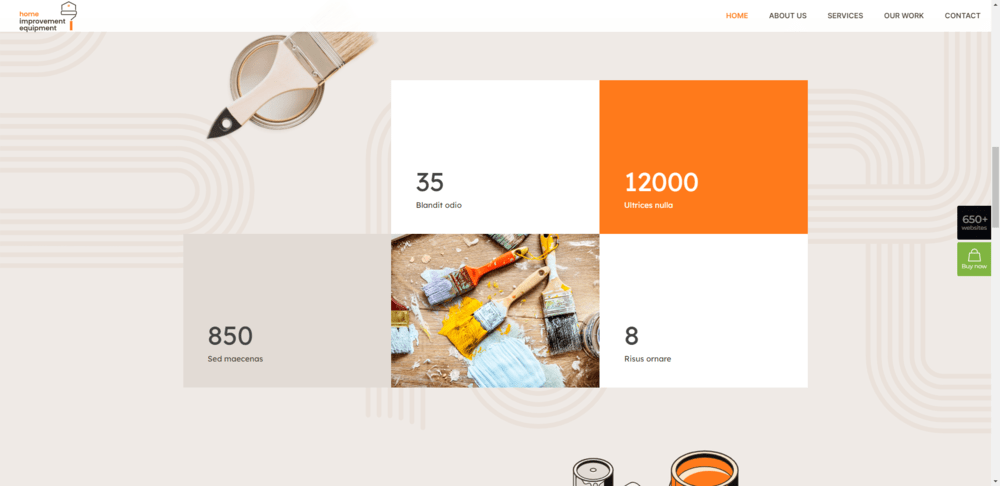
In 2023, web designers will begin working with organic shapes by adding small, strategic textures to their designs. The BeRenovate 5 website illustrates an example of this new trend:
The rounded shapes and lines that appear in the background have a softening effect while at the same time drawing attention to the central section, making the page more interesting and engaging.
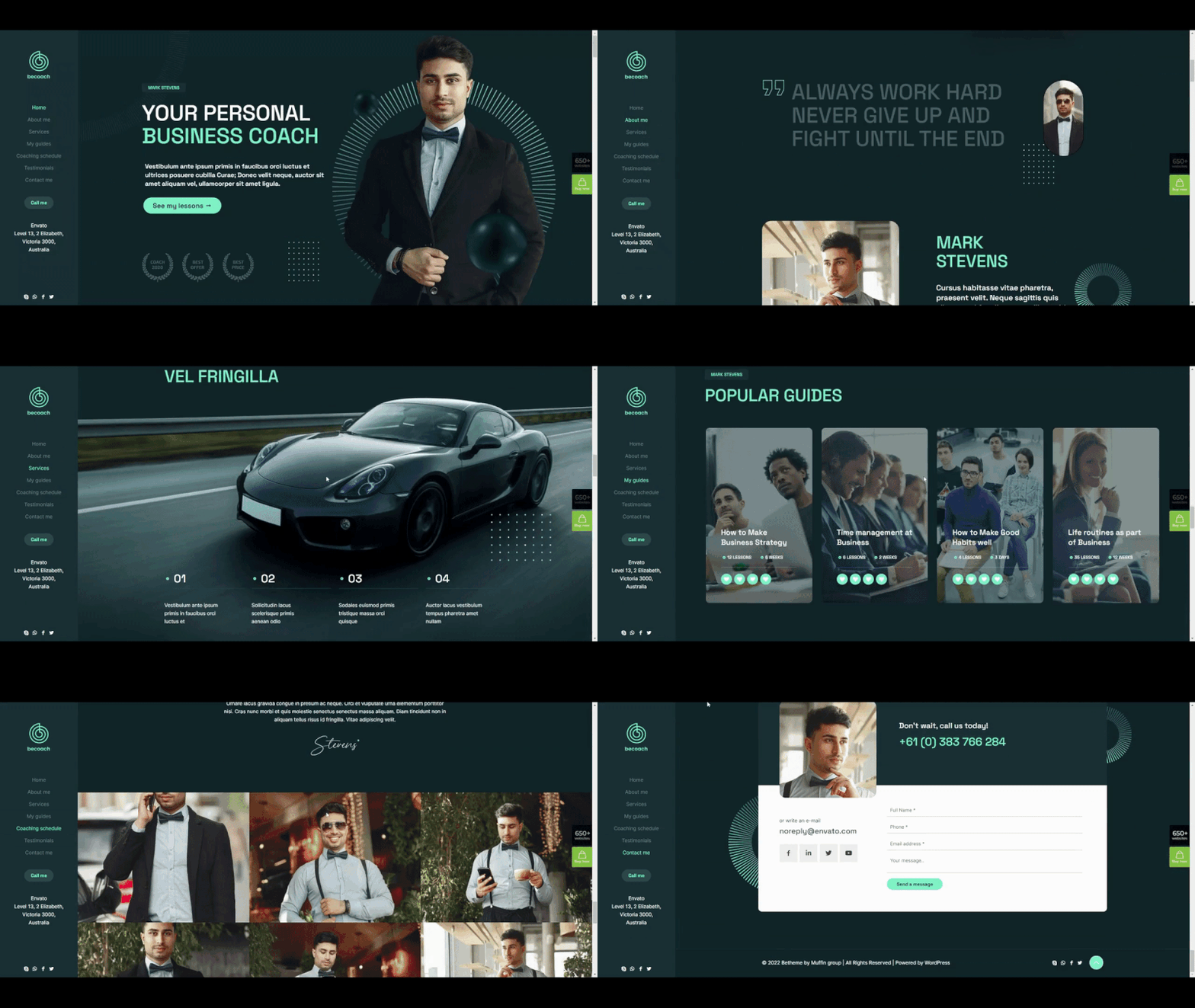
Digital texturization can also be used to draw attention to a specific area of a page. BeCoaching 3 provides an example of this effective design trend.
The two digitally textured shapes seen here are used throughout this one-page website to help direct a visitor’s eyes and attention to the areas of the page you want them to go. All of the content in the example is important, but the image on the right is key and not to be missed.
5. Benefits of supplemental video
Different web users have different viewing habits, making it extremely difficult, if not impossible, to satisfy them all. Some prefer reading text or blogs. Others would rather to watch and listen to a video or a vlog.
Rather than trying to satisfy both worlds, experiment with using supplemental videos or video alternatives whenever it makes sense to do so. You’re less apt to downgrade site loading speeds, and avoiding an overreliance on autoplay videos would probably earn you some good marks from your users.
The BeBusiness 6 site’s full-width video section halfway down its home page jumps right out at you.
It could be used to summarize or expand on previous content, to show a video testimonial, or for a variety of other purposes.
A video doesn’t have to be full width to be effective. This BePregnancy hero section example includes a small cutout that features a supplemental video:
The “Play” button is instantly recognizable and gives a visitor the option of whether or not to watch the video. In this instance, the choice to watch would probably win hands down, but if the video were autoplay it would probably be looked upon as being intrusive.
Using videos sparingly and strategically makes sense. Visitor’s will likely approve, and it is easier for web designers to maintain reasonable page loading speeds.
What is your opinion of these website design trends?
Website design trends have more often than not focused on background and color trends, typological experimentation, attention-getting special effects, and other approaches that, while well-intentioned and usually effective, could also be viewed as being superficial to some degree.
2023’s web design trends signify a sea change in website improvement techniques. The focus is more on trust building, responsiveness, and accessibility than on user engagement or entertainment.
Use BeTheme to build websites and you’ll discover that these new trends have already been incorporated to one degree or another in many of its 650+ pre-built sites. Good news indeed!
Source link


